


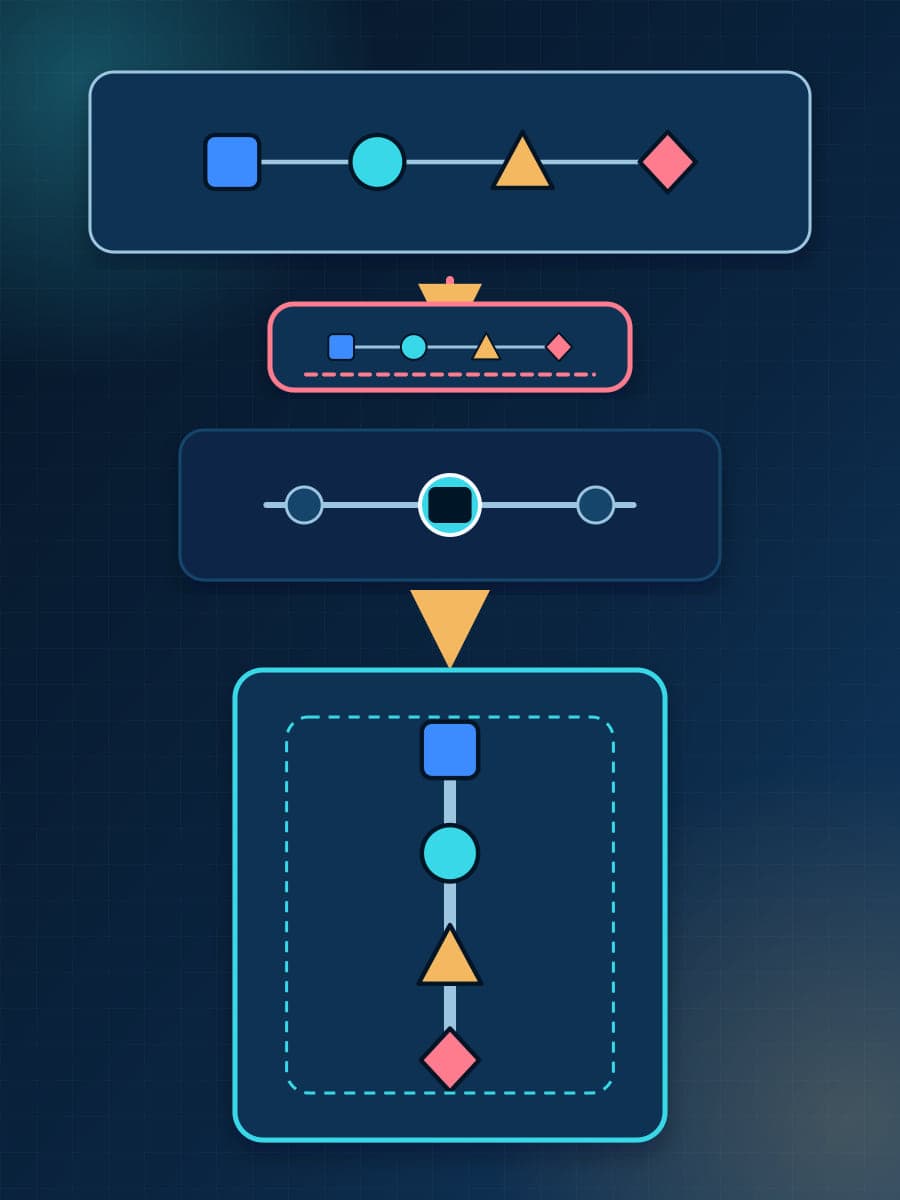
A 1600×900 technical diagram can be sharp at its source and still fail on a phone. When a dense 16:9 composition fits into an approximately 356-pixel content column, it becomes a strip about 356×200 CSS pixels. Every label, connector, and card shrinks with it. More source pixels can keep the edges clean, but they do not make the words larger.
We found this failure in three BaristaLabs articles. The diagrams were fully contained, and the pages did not have horizontal overflow. Each fix used a separately authored portrait composition, selected for mobile with the HTML <picture> element. This tutorial explains what changed, how source selection works, and how to verify the result without turning one site breakpoint into a universal rule.

A sharp source can still produce small rendered content
An image has an intrinsic size and a rendered size. Intrinsic size describes the source file, such as 1600×900 pixels. Rendered size describes the CSS box that the browser gives the image on the page. A responsive rule such as width: 100%; height: auto can reduce a 16:9 source to about 356×200 CSS pixels while preserving its aspect ratio.
A higher-density response can improve sharpness at that rendered size. It cannot change the physical size of a label inside the image. If a label occupies 80 of the source’s 1600 horizontal pixels, the browser still reduces that label with the rest of the composition.
The responsive-image attributes have separate jobs. srcset gives the browser candidate files. When candidates use width descriptors, sizes tells the browser how much page width the image is expected to occupy so it can choose a suitable candidate. Neither attribute inspects a diagram and moves horizontal cards into a vertical sequence.
CSS fitting also has a narrower job. object-fit: contain keeps all source pixels visible inside a frame. object-fit: cover can fill the frame by cropping some pixels. object-position can move the visible area. These properties resize or crop an existing composition. They do not author a new reading order.
Example
Constraint note: Resolution can fix fuzzy edges. Composition controls whether the reader can follow the diagram at its rendered size.
Three production fixes changed the reading order
We checked the prior QA records, replacement assets, and current production output for three articles at a 390×844 CSS-pixel viewport. In each prior state, the inline content width was approximately 356 pixels. The failure was density after scaling, not clipping.
Scroll sideways to see all 4 columns.
| Production example | Prior rendered box | Mobile source and current rendered box | Compositional change |
|---|---|---|---|
| AlphaEvolve release boundary | 356×200 CSS px | 900×1280 source; about 356×506 CSS px | Two side-by-side decision panels became stacked cards. A selected-candidate connector now exposes the handoff from optimization to separate release review. |
| Daybreak and Bedrock data boundary | 356×200.25 CSS px | 900×1820 source; about 356×720 CSS px | Three horizontal stages became numbered vertical cards. Connector labels expose approved inputs and the separate classifier path, while the customer-duty recommendation remains visually separate from the AWS-published description. |
| AWS 20-file document classification | 356×200.25 CSS px | 780×1400 source; about 356×639 CSS px | Five horizontal cards became one vertical dependency path. Qualifiers show which stages are optional or depend on validation, and the stop condition becomes a separate final rule. |
The replacements did more than add height. Each one changed the order in which the reader meets the information. A horizontal comparison became a top-to-bottom handoff. A row of stages became a numbered sequence. Relationships that had to be inferred from small connectors became explicit.
This is first-party production evidence with a narrow claim. Browser inspection proves which source loaded and how large it rendered. The before and current captures show the changed composition, and reviewers judged the new versions easier to read at normal zoom. We did not measure comprehension, reading time, or conversion.
Use a crop only when the remaining view keeps the meaning
A crop can be enough for a photograph, product screenshot, or simple illustration with one clear focal area. It can also work when a diagram includes optional surrounding context that the mobile reader does not need. The crop must preserve the subject, required labels, and the relationship that the image is meant to explain.
A dense technical diagram needs a new composition when decision-critical labels become too small, connectors cross or collapse, or a horizontal sequence no longer has a clear reading order. In that case, stack the stages, preserve required boundaries, and redraw the connectors for the vertical path. The browser will select the new asset. A designer or content author must create it.
Do not select a breakpoint from a generic device list. Place the desktop composition in the real article container and reduce the viewport. Use the media condition where the content fails, then test both sides of that condition. The three BaristaLabs examples use (max-width: 639px) because that rule fits this site’s layout. It is an implementation detail, not a standard for technical diagrams.
Example
Constraint note: A taller mobile diagram adds page length. That trade is useful only when the added height restores required labels and relationships.
Use <picture> to select the mobile composition
MDN describes responsive image art direction as supplying a cropped or modified image for a different media condition. The <picture> element provides that selection layer. The browser checks its <source> elements and uses the first suitable source. If none match, it uses the child <img>.
The following plain HTML uses the live AlphaEvolve assets. It includes a print source, a portrait mobile source, and a literal desktop fallback image.
<style>
  #release-review img {
    display: block;
    width: 100%;
    height: auto;
    aspect-ratio: 1400 / 788;
  }

  @media screen and (max-width: 639px) {
    #release-review img {
      aspect-ratio: 900 / 1280;
    }
  }
</style>

<figure id="release-review">
  <picture>
    <source
      media="print"
      srcset="https://www.baristalabs.io/blog/print/alphaevolve-score-is-not-release-gate-review-print.jpg"
      width="1400"
      height="788"
    >
    <source
      media="(max-width: 639px)"
      srcset="https://www.baristalabs.io/blog/inline/alphaevolve-score-is-not-release-gate-review-mobile.svg"
      width="900"
      height="1280"
    >
    <img
      src="https://www.baristalabs.io/blog/inline/alphaevolve-score-is-not-release-gate-review.jpg"
      width="1400"
      height="788"
      loading="lazy"
      decoding="async"
      alt="A selected candidate moves from optimization inputs visible to the search into a separate release review with unseen cases, code checks, operating checks, and release, revision, or rejection outcomes."
    >
  </picture>
  <figcaption>
    The mobile source stacks optimization and release review into a vertical handoff.
  </figcaption>
</figure>
Keep the <img> even when every current browser supports the planned sources. It supplies the fallback request, alternative text, loading behavior, and the element that presents the selected image. Put the alt text on the <img>, not on <source>.
The width and height values describe intrinsic dimensions and help the browser reserve space before the file finishes loading. The mobile <source> has its own dimensions because its aspect ratio differs from the fallback. The matching CSS rule also changes the image box’s aspect ratio when the viewport crosses the media condition. Confirm the generated markup and resize behavior when a framework rewrites images.
If you provide several width candidates for the same composition, add srcset and sizes for resource selection. Keep the portrait source as a separate art-directed asset. A smaller file of the landscape diagram still contains the landscape diagram.
Verify the selected source and the rendered result
A responsive diagram is complete only when the browser selects the intended file and a reader can use it in the actual layout. Start at the target mobile viewport and normal zoom. Scroll the figure into view so lazy loading and deferred rendering have run.
Inspect the image with a browser console. This snippet reports the selected source, intrinsic response size, rendered box, and page overflow for the example above:
const image = document.querySelector("#release-review img");
const box = image.getBoundingClientRect();

console.table({
  currentSrc: image.currentSrc,
  naturalSize: `${image.naturalWidth}×${image.naturalHeight}`,
  renderedSize: `${box.width.toFixed(2)}×${box.height.toFixed(2)}`,
  documentOverflow:
    document.documentElement.scrollWidth -
    document.documentElement.clientWidth,
});
currentSrc should contain the portrait asset while the mobile media condition matches. The rendered width should fit the article container, and document overflow should be zero. A content delivery network or framework can return an optimized derivative, so the response’s natural dimensions can differ from the original source file. Fetch and decode the public asset separately when exact original dimensions are part of the acceptance criteria.

The source-selection figure was generated at 2026-08-22T19:42:41.161Z from the retained live observation recorded at 2026-08-22T17:11:27.042Z; it is not the raw observation.
Geometry is only the first check. Read every decision-critical label at normal zoom. Follow the connectors in the intended order. Confirm that colors are not the only way to distinguish states and that the alt text explains the figure’s purpose and important relationships. Check the caption against the pixels rather than against an earlier design brief.
Then test the other delivery conditions. Increase the viewport beyond the mobile media condition and confirm that currentSrc changes to the intended desktop source. Resize around the condition to find overlap, unexpected source selection, or layout shift. Open print preview and confirm that the print source, caption, page width, and page breaks remain usable. Repeat the overflow check on desktop and in the narrowest supported content container.
Example
Constraint note: A screenshot can show clipping and small text. It cannot prove which resource loaded. Keep the visual check and the DOM check together.
Make composition part of diagram QA
A diagram should enter review in the same states in which readers will receive it. Check desktop, the actual mobile content width, and print before publication. Record the selected source, rendered geometry, overflow, reading order, required labels, alt text, and caption. If the desktop asset fails in the mobile container, decide whether a valid crop exists. If it does not, author a separate composition and select it with <picture>.
That is the standard these three BaristaLabs fixes now support. The measured result is specific: portrait sources replaced compressed 16:9 compositions at mobile width, all three intended mobile sources loaded in production, and the pages had no measured horizontal overflow. The wider lesson is a release decision: test the information at the size readers get, then change the composition when scaling preserves pixels but loses meaning.
Sources
- MDN:
<picture>: The Picture element, accessed August 22, 2026. - BaristaLabs: AlphaEvolve can optimize a score. It cannot define production success., production example accessed August 22, 2026.
- BaristaLabs: OpenAI Daybreak on Bedrock still leaves the data boundary with the customer, production example accessed August 22, 2026.
- BaristaLabs: AWS document classification should earn its second lane on 20 files, production example accessed August 22, 2026.
Turn this idea into a pilot
Which workflow should go first?
Use the readiness check to compare impact, effort, risk, owner, and next step before requesting a review.
- 3-5 minutes
- Deterministic score
- No sensitive data
Practical AI Workflow Notes
Want more practical AI operations ideas?
Get short notes on applying AI inside real small-business workflows — from document handling and customer follow-up to internal reporting, compliance, and automation guardrails.