


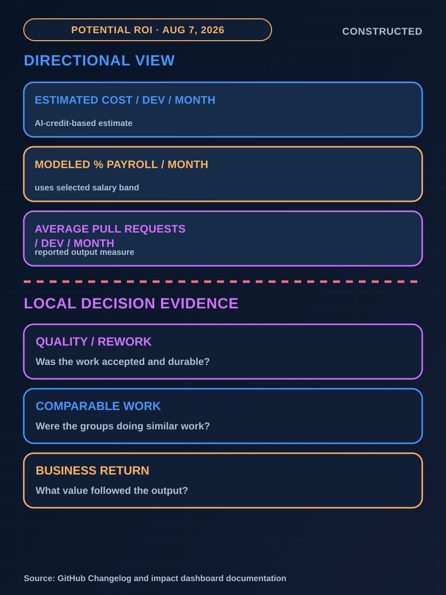
GitHub added a “Potential return on investment” section to the Copilot impact dashboard on August 7, 2026. The section puts estimated Copilot cost and pull-request output beside each other for two developer groups. Engineering, finance, and operations leaders can now see an economic-looking comparison in the same place where they review adoption depth.
The name matters because the cards can move quickly from an adoption review into a renewal or expansion case. They do not establish financial return, productivity, cost savings, quality, or causal impact. This article explains the measurement limits and the smallest decision the cards can support.
Each card pairs estimated Copilot cost with pull-request output
According to the August 7 GitHub changelog, the new section has two cards. One covers Passive users plus Phase 1. The other covers Phase 2 plus Phase 3. Each card reports three measures for its group.
Scroll sideways to see all 4 columns.
| Dashboard label | Unit and population | What it can describe | Interpretation limit |
|---|---|---|---|
| Cost/dev/month | Average monthly Copilot cost per developer in the card's group | GitHub's estimate based on actual AI-credit consumption | It is an estimate, not the organization's billed cost |
| % Payroll/month | The estimated cost above as a share of the selected compensation band | The scale of estimated Copilot cost relative to a modeled salary input | It is not actual payroll or a measured labor saving |
| Pull requests/month | Average pull requests per developer per month in the card's group | Pull-request output for that population | The card description does not say merged pull requests, quality, or financial value |
The salary selector lets an administrator choose a compensation band, and the cost-derived metrics recalculate. The band is a modeling input, not actual payroll data. Changing it does not turn pull-request output into a monetary benefit.
The section is available in enterprise and organization impact dashboards when the Copilot usage metrics policy is enabled. The August 7 changelog says enterprise owners and billing managers, organization owners, and people with a custom organization or enterprise role that grants the View Copilot Metrics permission can access it. GitHub's impact dashboard documentation describes adoption depth and its connection to pull-request output.
The cards compare different adoption groups
The cards do not follow the same developers before and after deeper Copilot use. They compare Passive users plus Phase 1 with Phase 2 plus Phase 3. The groups can differ in seniority, team, repository, work type, project complexity, release schedule, and review practice.
GitHub gives a related warning in its adoption-multiplier guidance. That separate measure compares engaged users with passive users on merged pull requests per user per month and time to merge. GitHub says the populations differ and names team composition, project complexity, and seniority among the factors that can influence the result beyond Copilot usage.
The potential-ROI cards use a different grouping and a “Pull requests/month” label, so the two dashboard surfaces must stay distinct. Both still compare populations. A higher average for Phase 2 plus Phase 3 can reflect Copilot use, the developers and projects in the group, or both. Our explanation of GitHub Copilot adoption cohorts covers the phase definitions; here, the important boundary is who each card includes.


Pull-request output does not establish return
The changelog describes the new card as average pull requests per developer per month. It does not describe that measure as merged pull requests. GitHub's separate adoption-multiplier documentation explicitly uses merged pull requests, which is why substituting that definition on the potential-ROI card would overstate what the source establishes.
A pull-request count does not state how much work each change contains, whether it passed review, whether it shipped, or whether it produced a useful business change. Repository conventions also affect the count. One team may split work into small pull requests while another combines similar work into fewer changes.
The cards omit review work, rework, test failures, defects, reverts, incidents, support burden, and developer experience. These measures change the cost and value of higher output. More pull requests can help when changes are useful, or add work when reviewers must correct them.
GitHub derives Cost/dev/month from actual AI-credit consumption, but calls the cost figures estimates and tells administrators to treat the metrics as directional. The selected compensation band gives that estimate a payroll scale. It does not measure time saved or compensation recovered.
A return claim needs a valued benefit and the costs required to produce it. These cards place estimated AI-use cost beside one output count. They do not assign financial value to the output or include the rest of the delivery cost. “Potential” is doing necessary work in the section name.
The 28-day count fix creates a dashboard boundary
The same August 7 release changed how the impact dashboard counts users in adoption cohorts. Counts now include every user active during the full 28-day reporting window. Before the fix, a cohort count included only users active on the final day of that window, so a report ending on a weekend or holiday could show sharply lower counts.
GitHub says cohort counts may be noticeably higher after the change. The corrected population definition can cause that increase when developer behavior stays the same. The fix applies only to the impact dashboard; the Copilot usage metrics API and NDJSON exports are unchanged.
Mark August 7 as a definition boundary in dashboard cohort trends, and record whether each chart came from the dashboard, API, or export. A higher post-change count does not show adoption growth by itself. This change is narrower than the July expansion covered in our article on Copilot app metric definitions, but it has the same practical consequence: the measured population changed.
The changelog does not explain whether, or by how much, the correction changes each potential-ROI card value. That downstream effect remains unknown.
Local evidence must connect output to cost, quality, and work
Start with a stable local population. Select a named team, repository set, or work type, and compare fixed periods with similar conditions. Record team changes, major releases, migrations, and shifts in project complexity. Label changes in the population or work mix.
Finance should replace the estimate with the organization's billed seat and usage costs for the same population and period. Keep the salary band as a modeling assumption, not payroll. If the business case values staff time, measure the work that changed and state how the team valued that time. A higher pull-request average does not become labor savings.
Engineering and operations should connect pull requests to later delivery results. Check merged changes, cycle time, review time, corrections, test failures, reverts, incidents, and production outcomes where local systems provide them. Keep repository and work-type differences visible because they affect pull-request counts.
Add developer feedback through a short survey or retrospective. GitHub recommends combining dashboard trends with feedback and team-level data. Responses can show whether Copilot reduced routine work, shifted effort into prompting or review, or created friction outside the cards. Investigate any disagreement across cost, delivery, quality, and developer evidence before a larger commitment.
The dashboard supports a bounded next decision
The smallest defensible decision from the new section is to select one population for a local review. A favorable card difference can justify checking the same team's actual cost, delivery, review, quality, and feedback data. It cannot justify an enterprise-wide ROI claim or broad expansion by itself.
If the local evidence holds under a stable comparison, approve one named scope change, such as one team, repository group, or enablement effort, with a fixed review period and a stop condition. If it does not hold, keep the scope, revise the intervention, or stop the test. Our guide to expanding, revising, or stopping an AI pilot applies the same decision discipline. BaristaLabs AI consulting can help connect the dashboard to local billing, delivery, quality, and review evidence.
For renewal, the dashboard can support continued access for the defined population while that evidence is collected, if the cost fits the approved test budget. For expansion, it can identify the next population to examine. Commit further only when the local evidence supports that specific increase.
Use the GitHub Copilot enterprise-controls guide to record the dashboard population, window, cost source, interpretation limit, owner, and next review trigger beside local outcome evidence.
AI measurement review
Turn a directional dashboard into a bounded decision
Define the population, comparison period, actual cost, delivery outcome, and quality evidence needed to support one Copilot renewal or expansion choice.
Best fit for teams preparing a Copilot renewal, expansion, or finance review from impact-dashboard data.
AI measurement review
Turn a directional dashboard into a bounded decision
Define the population, comparison period, actual cost, delivery outcome, and quality evidence needed for one Copilot renewal or expansion choice.
Review the measurement modelBest fit for teams preparing a Copilot renewal, expansion, or finance review from impact-dashboard data.
Turn this idea into a pilot
Which workflow should go first?
Use the readiness check to compare impact, effort, risk, owner, and next step before requesting a review.
- 3-5 minutes
- Deterministic score
- No sensitive data
Practical AI Workflow Notes
Want more practical AI operations ideas?
Get short notes on applying AI inside real small-business workflows — from document handling and customer follow-up to internal reporting, compliance, and automation guardrails.