


Constructed mini-experiment: one question, three charts
The following example is illustrative. It does not describe a real company or a published Flint evaluation.
An operations lead asks a recurring question: Are onboarding delays getting worse?
The available data is small enough to inspect without a dashboard. Each row represents a monthly cohort observed for at least seven days. median_days_to_activation covers accounts that activated; overdue_accounts counts accounts from that cohort that missed a seven-day activation target.
month,accounts_started,median_days_to_activation,overdue_accounts
April,80,4.8,14
May,92,4.5,16
June,118,4.1,20
July,140,3.9,22
One chart plots median days to activation. Its line slopes down from 4.8 to 3.9 days. Among accounts that activated, onboarding appears to be getting faster.
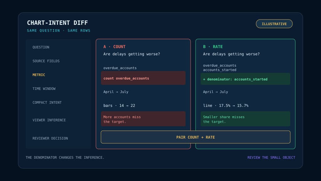
A second chart plots the number of accounts in each cohort that missed the seven-day target. Its bars rise from 14 to 22. More accounts are being delayed.
A third divides those missed-target accounts by all accounts started in the same cohort. The rate slips from 17.5% to 15.7%. The proportion delayed is improving, though slowly.
All three charts can be accurate. All three can compile cleanly. All three can arrive with sensible axes, restrained labels, good spacing, and a polished color treatment.
They still answer different questions.
The first treats delay as duration among accounts that activated. The second treats it as the number of target misses. The third treats it as the cohort miss rate. A reader scanning any one of them could reasonably leave with a different account of July.
This is where agent-generated reporting gets interesting. Chart syntax is often tedious, but syntax is rarely the most consequential choice in the room.
The consequential choice is what “getting worse” should mean when monthly volume has nearly doubled.
The hidden decision arrives before the compiler
A chart compiler can decide that a quantitative axis should begin at zero. It can prevent labels from colliding, select a tick format, sort categories, and make room for a legend.
It cannot discover that the operations lead meant “the share of each monthly cohort missing our activation target” rather than “the number of accounts that missed it.” Nor can it decide whether a median that excludes accounts still waiting answers the original question.
That distinction sits upstream of presentation. It lives in the translation from a business question to a field, denominator, aggregation, time window, and comparison.
This is familiar territory for analytics teams. Metric ownership begins before visualization, when someone decides which source fields and transformations earn the right to represent a business concept.
AI-generated charts compress that translation into a much smaller surface. The agent may produce only a few lines of intent, then hand the mechanical work to a compiler.
That is useful. It also concentrates responsibility.
A compiler can faithfully optimize the wrong interpretation. The result may be easier to trust precisely because nothing looks broken.
What Microsoft Flint puts between intent and rendering
Microsoft Research’s Flint is an open-source visualization intermediate language for this compressed authoring model.
Its README describes the project this way: “Flint is a visualization intermediate language that lets AI agents create expressive, polished visualizations from simple, human-editable chart specs.”
The agent supplies the data, semantic types, chart type, and encodings. Flint derives lower-level settings such as scales, axes, spacing, labels, and layout.
A stripped-down input for the rate interpretation might look like this:
{
  data: { values: monthlyOnboarding },
  semantic_types: {
    month: "Category",
    overdue_rate: "Quantity"
  },
  chart_spec: {
    chartType: "Line Chart",
    encodings: {
      x: { field: "month" },
      y: { field: "overdue_rate" }
    }
  }
}
The important line is not the chart type. It is the decision to supply overdue_rate.
Once that decision has been made, the compiler can handle a large amount of visual housekeeping. The same Flint input can produce native Vega-Lite, ECharts, or Chart.js specifications.
The project reports more than 70 semantic types and more than 30 chart types across those backends. That wording matters: it does not promise identical support for every chart type in every renderer.
Flint’s first GitHub release, version 0.1.1, was published on June 28, 2026. It reached wider public attention through a July 8 Show HN discussion, which had reached 345 points when reviewed.
The attention is evidence of interest, not evidence of reliability. Flint’s README says a research paper is coming soon, so there is no published research evaluation to lean on yet.
The discussion also exposed a useful disagreement.
Some commenters asked whether Flint adds enough beyond Vega or ECharts JSON. One practitioner working on an analytics system said their team had not found Python and R chart generation especially difficult, even with smaller models.
Another commenter, cpard, saw a broader systems pattern:
Example
“There’s an emerging pattern in agentic systems and this project is a great example. A deterministic layer like a compiler or generator of code with some kind of IR that the LLM generates and feeds it with.”
Both reactions can be true.
Models may already produce competent chart code in many settings. A semantic intermediate language can still offer a smaller, more stable object for people and software to inspect.
Flint’s bet is less about whether a model can write Vega-Lite. It is about where teams want variation to stop.
A compact spec meets a real product chart system
A draft engineering experiment at PostHog offers a useful view of that boundary.
The open change proposal explores using Flint’s compiler decisions while emitting props for PostHog’s own Quill chart components.
The proposal gives the appeal a memorable scale: “an agent writes a ~10-line semantic chart spec.”
Flint handles semantic resolution, sorting, zero-baseline decisions, formatting, and overflow behavior. Quill keeps control of product-specific colors, component behavior, and pixel-level presentation.
That separation is more revealing than a simple “AI made a chart” demo.
The compact specification carries the analytical intent. The deterministic compiler expands it. The product’s existing component system preserves its visual language.
The experiment also shows where portability stops.
Its supported intersection includes bar, grouped bar, stacked bar, line, area, pie, and doughnut charts. Faceting and named-view pivots are outside its scope. Scatter plots and heatmaps are notable gaps.
The author reports 18 tests covering routing and inference behavior. The Storybook examples were not visually tested in that environment.
Those details keep the experiment in proportion. It is working exploratory code, not production adoption or proof that semantic compilation produces the right chart.
More importantly, the gaps reveal a design choice every team will face. A shared intermediate language can standardize intent only where the destination system has a meaningful way to express that intent.
A compact spec does not erase backend differences. It makes those differences easier to locate.
Review the small thing that causes the large thing
Traditional chart review often starts too late.
A reviewer sees the rendered image, notices a strange axis, and asks for a revision. If the chart looks normal, the review may end there.
With a semantic compiler, much of the low-level output is derived. Reading hundreds of generated Vega-Lite or ECharts properties may tell you how the chart was assembled without telling you why this metric was chosen.
The compact intent deserves the closer review.
That changes the useful unit of inspection. The generated chart code becomes build output. The field selection, semantic type, aggregation, and encoding become the authored decision.
A technical pass can confirm that the specification is valid and the renderer produced an artifact. It cannot confirm that the viewer will infer the intended operational meaning.
That gap resembles the one between passing a benchmark and succeeding in production. Mechanical success can hide a mismatch between the tested behavior and the decision people actually need to make.
The smaller the authored object becomes, the less excuse there is to skip that review.
Run a chart-intent diff
Take the onboarding question and compare two plausible interpretations before compiling either one.
  QUESTION
  Are onboarding delays getting worse?

- COMPACT INTENT
- Plot overdue_accounts by month.
- Treat delay as the number of accounts in each cohort
- that missed the seven-day activation target.

+ COMPACT INTENT
+ Plot overdue_accounts / accounts_started by month.
+ Treat delay as the share of each monthly cohort
+ that missed the seven-day activation target.

  COMPILED OUTPUT
  Both versions receive a time-ordered x-axis,
  quantitative y-axis, labels, spacing, and layout.

- VIEWER INFERENCE
- More accounts are missing the activation target.

+ VIEWER INFERENCE
+ A smaller proportion of each cohort is missing it.
That is a chart-intent diff: a comparison between the question asked, the compact specification supplied, the output the compiler derives, and the conclusion a viewer is likely to carry away.
It is deliberately closer to code review than dashboard critique. The point is to expose the smallest semantic change that can reverse the apparent conclusion.
Run the exercise with people who know the operation, not only the charting library. Ask them to read the question first, then the compact spec, then state what they expect the chart to imply before they see it.
If their expected inference differs, the disagreement has arrived early enough to be useful.
Perhaps both count and rate belong in the report. Perhaps the median among activated accounts hides the ones that never activated. Perhaps “getting worse” needs an agreed service-level threshold and cohort definition before anyone chooses a mark.
Those are analytical decisions. More capable rendering will not settle them.
Beautiful output raises the cost of a vague question
Microsoft Flint is a compelling example of how AI data visualization may be assembled: a model authors compact semantic intent, a deterministic compiler expands it, and an established renderer produces the final chart.
That architecture can reduce syntax errors and visual busywork. It can also make a weak interpretation look finished sooner.
The review process has to move with the abstraction.
Before an AI-generated chart enters a recurring report, compare the business question with the source fields and the compact intent. Then write down the conclusion a reasonable viewer would draw.
If those pieces do not agree, do not tune the colors. Change the interpretation.
Bring BaristaLabs one recurring dashboard question and the source fields available to answer it. We’ll help you run a chart-intent diff before automating the visualization.
Before automation
Test one recurring chart question against its compact intent
BaristaLabs helps analytics and operations teams expose the semantic choice that can reverse a chart's apparent conclusion before generation becomes routine.
Best fit for teams considering AI-generated dashboards, recurring reports, or chart automation where polished output could outrun metric interpretation.
Turn this idea into a pilot
Which workflow should go first?
Use the readiness check to compare impact, effort, risk, owner, and next step before requesting a review.
- 3-5 minutes
- Deterministic score
- No sensitive data
Practical AI Workflow Notes
Want more practical AI operations ideas?
Get short notes on applying AI inside real small-business workflows — from document handling and customer follow-up to internal reporting, compliance, and automation guardrails.